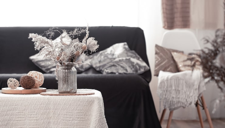
Black and white decor is one of the most enduringly popular interior palettes, precisely because the contrast is so visually striking and inherently versatile across nearly every design style. It’s also one of the easiest palettes to get wrong, tipping into either sterile starkness or an unintentionally graphic, almost chessboard-like effect if applied without enough nuance.
The Real Secret: It’s Rarely Truly 50/50
The most successful black and white interiors rarely split the palette evenly. Instead, one tone — usually white or a soft off-white — dominates as the base, with black used more sparingly as accent and contrast, typically in a roughly 70/30 or 80/20 ratio. A room that splits black and white more evenly tends to feel busier and more visually demanding than one with a clear dominant base and intentional accent use.
Texture Prevents the Flatness Black and White Can Risk
Without texture variation, a black and white room can feel flat and one-dimensional regardless of how well the color balance is handled. Mixing matte and glossy surfaces, varied fabric textures (velvet, linen, wool), and different material finishes within the same black-and-white palette adds the visual depth that color alone would otherwise provide, keeping the room feeling rich rather than stark.
Warm vs. Cool Undertones Matter More Than People Expect
Not all whites and blacks read the same — a warm-toned white paired with warm wood furniture feels considerably cozier than a stark, cool-toned white in the same room. Choosing whether your black and white scheme leans warm (cream whites, soft charcoal blacks, warm wood accents) or cool (bright whites, true blacks, metal and glass accents) creates a more cohesive overall feeling than mixing undertones inconsistently throughout the same space.
Pattern Is Where Black and White Decor Gets Genuinely Interesting
Graphic patterns — stripes, checks, florals rendered purely in black and white, geometric prints — are one of the signature strengths of this palette, since the high contrast makes pattern read clearly and confidently in a way that more muted color palettes often can’t achieve as dramatically. A patterned rug, an accent wall, or statement textiles are excellent places to let black and white pattern genuinely shine, rather than spreading pattern thinly and inconsistently throughout a room.
Add a Single Accent Color Sparingly, If You Want One
While pure black and white works beautifully on its own, a single, carefully chosen accent color — a deep green, a warm brass, a soft blush — used sparingly can prevent the palette from feeling overly austere for people who want a touch of warmth without abandoning the overall scheme. The key word is sparingly; more than one accent color tends to dilute the clean, confident effect that makes black and white decor work in the first place.
Where the Palette Shines Brightest
Entryways, kitchens, and bathrooms tend to particularly suit a confident black and white treatment, since these are spaces where a bold, graphic statement reads as intentional design rather than risking feeling cold in a space meant for prolonged relaxation, like a bedroom or living room, where warmth is generally a higher priority.
The Underlying Principle
Black and white decor done well isn’t really about the absence of color — it’s about using contrast, texture, and proportion thoughtfully enough that the palette feels rich and considered rather than simply stark.